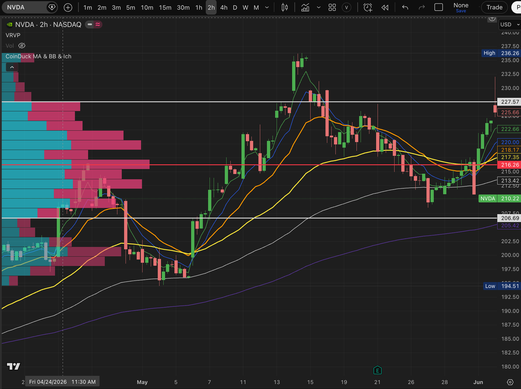
Honest Advice From a 15-Year Trader. When you first start analyzing stock charts with TradingView Indicators, you are flooded with so many tools. Facing hundreds or even thousands of technical tools can be overwhelming. It makes you wonder, “How on earth am I supposed to combine and use all of these?”
When I first started out, I did exactly what everyone else does—I just copied what other people were doing. I drew moving average lines, support levels, and resistance lines, all while constantly doubting myself: “Am I even doing this right?” But when I actually made trades based on just blindly following those lines, I lost money way more often than I won.
That is when beginner traders usually fall into a major trap. They think, “Maybe I lost because I didn’t use enough indicators.” So, they start adding more and more tools to their charts. Eventually, the chart becomes a messy web of tangled lines and confusing symbols. It gets so cluttered that you can barely even see the actual price bars (candles). Out of frustration, you wipe the chart clean, start over, try a new chart layout, and delete it again… If you have ever traded stocks, I am sure you have gone through this exhausting cycle at least once.
The Reality of Technical TradingView Indicators
In reality, the most popular indicators that people put on their charts can be grouped into three main types:
- Trend and Momentum Indicators: EMA, SMA, RSI, MACD, Stochastic Oscillator, Super Trend
- Volatility and Structure Indicators: Bollinger Band (BB), Fair Value Gap (FVG), Gap Detector
- Volume-Based Indicators: Money Flow Index (MFI), Volume Profile, VWAP
These indicators with fancy names all have different jobs. Some tell you if the price is currently heading up or down. Others try to show you if the market is “overheated” (meaning it has gone up too fast and might drop soon). Some draw upper and lower boundaries to show how wildly the price is bouncing around, while others calculate how much real money is flowing into the market by looking at trading volume.
Years ago, I used to be obsessed with these tools. I didn’t want to miss a single thing, so I loaded up my charts with six different Exponential Moving Average (EMA) lines all at once—the 5, 10, 20, 50, 100, and 200 lines. I packed the bottom of my screen with RSI and MACD windows, and to top it off, I overlaid Bollinger Bands over everything. I was analyzing charts like I was trying to solve a complex math equation.
But now, after 15 years in the stock market, I never analyze charts that way anymore. Through countless real-world trades and painful losses, I learned a valuable lesson: these tradingView indicators should only be used as a “secondary check” once in a while, just to see if your initial thought makes sense. Today, I actually prefer to clear off all those messy lines and look at a clean chart with nothing but the candles (price bars).
Beware the Trap of Lagging Indicators
The reason for this is simple and clear. Almost every indicator you see on your screen is a “lagging indicator.” This means it is entirely created by price and time that have already passed. No matter how smart or beautifully designed an indicator looks, it is just processing old data from the past.
These days, if you look at YouTube, Instagram, or X (Twitter), you will see endless ads promoting “revolutionary, brand-new indicators.” They act like they can predict the future, promising that if you just buy and sell whenever the “Buy/Sell signals” pop up on the screen, you will make easy money.
Please, do not buy into the hype. There is no indicator in the world that can see into the future. An indicator is just a shadow left behind by the price after it has already moved.
Of course, this doesn’t mean these indicators are completely useless. As I mentioned, when it comes to understanding the “big picture”—the giant backbone of the market—these lines can be a wonderful compass. Especially after the market closes, looking at how the EMA 5, 10, 20, 50, 100, and 200 lines are lined up on a daily or weekly chart tells you exactly how healthy a stock is.
Understanding the Moving Averages: From EMA 5 to EMA 200
Let me break down these major moving averages using very simple terms that anyone can understand:
1. EMA 5 (The Short-Term Heartbeat Line)
This line reflects the price action of just the last 5 days. Since it captures the market’s mood over exactly one trading week, it reacts very quickly and sensitively to price changes. If the price is riding high above this line, it means the excitement around the stock is at its peak.
2. EMA 10 (The Short-Term Brake Line)
This is the average price of the last 10 days. When a fast-rising stock takes a quick breather, this line is usually the very first place where the price catches its breath (support). On the flip side, if a stock is falling and tries to bounce back up, this line acts as the first ceiling (resistance) it bumps into.
3. EMA 20 (The Market Lifeline)
This is the single most important golden line in the stock market—often called the “psychological lifeline” of a trend. It shows the average price over a month (about 20 trading days). The big players (whales) who drive the market will fight hard to defend this line to keep their upward trend alive. As long as the price stays above the 20 line, we can assume the upward momentum is still healthy and strong.
4. EMA 50 (The Backbone Line)
This represents the average price of about two and a half months, and it determines the medium-term trend. No matter how much a stock shakes and wobbles, if it can hold its ground above the 50 line, the overall uptrend is safe. If this line breaks, the stock is likely heading into a deeper, longer drop.
5. EMA 100 (The Institutional Money Line)
This is the average price of roughly 5 months. It is a major benchmark used by large institutions and fund managers to decide whether to buy or sell in bulk. When a good stock drops near the 100 line, big money often steps in, saying, “This is cheap enough,” and creates a solid floor to protect the price.
6. EMA 200 (The Ultimate Trend Line)
This line shows the average price over a full year (about 200 trading days). It is the absolute “final boss” of moving averages. It divides the market into two worlds: a long-term bull market (above the line) and a long-term bear market (below the line). If a stock drops below the 200 line and stays there, it is best to avoid it completely. But if a stock strongly breaks above the 200 line, it is a powerful signal that a massive, long-term upward shift is beginning.
These fixed, high-level indicators are incredibly useful for spotting the giant waves of the market. Personally, I only look at these lines when I need to step back and analyze the macro direction of a stock.
My Intraday Day Trading Setup
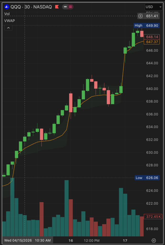
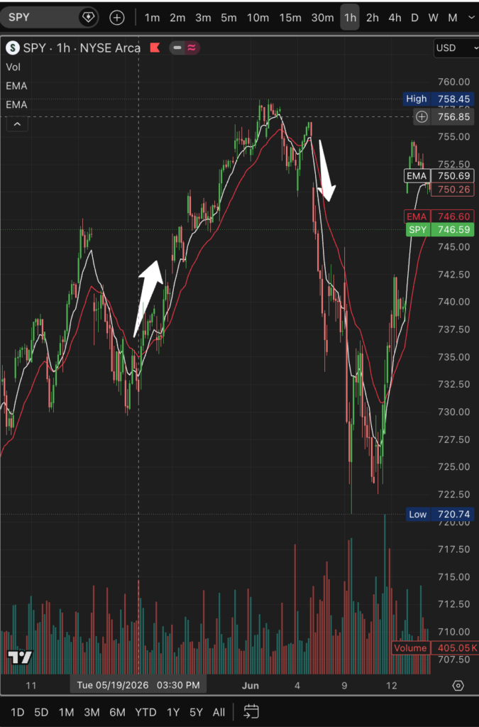
So, as a day trader who buys and sells within the same day, what is my real, go-to indicator?
As I mentioned before, I always look at the candles first. And along with the candles, I always look at the volume (how many shares are being traded). If a tall green candle shoots up, I check if trading volume is rising with it. If the price drops and a red candle appears, I look to see if heavy selling volume is breaking out. This is the only raw, unfiltered data that shows you the real-time flow of money and the true psychology of the market.
However, because human eyes and judgment aren’t perfect, I do use a little bit of help on my intra-day charts. Out of all the lines we talked about for the big picture, I keep just two simple lines on my real-time trading chart: the EMA 8 and the EMA 20.
When a chart is too complicated, your brain gets overloaded, and you hesitate to press the buy or sell button. The EMA 8 and 20 strategy is incredibly simple, but for day trading, there is nothing more effective.
These two lines work beautifully on 5-minute, 10-minute, and 15-minute charts. They even work surprisingly well on a fast-paced 2-minute chart. (A quick tip: try to avoid the 1-minute chart. It has too many fake movements and noise created by big players to trick retail traders).
The Core Rule: The EMA Cross
The basic rule for entering and exiting a trade is the “cross” of these two lines.
When the fast 8 line crosses below the slower 20 line, it’s a signal that the price is heading down.
On the flip side, when the 8 line crosses above the 20 line, it’s a signal that the price is gathering strength to go up.
While this rule sounds simple, putting it into practice isn’t easy. The price will often pretend to cross and then immediately snap back the other way to fool you. To protect myself from these fakeouts, I recommend combining this with Bollinger Bands. This small addition vastly improves your chances of winning.
For example, if the price drops all the way down to the very bottom boundary of the Bollinger Band, holds its ground, and starts curling up—and at the same time, the EMA 8 crosses above the EMA 20—you have a very high-probability buy signal. On the other hand, if the price reaches the very top boundary of the band, starts dropping, and the EMA 8 crosses below the 20, you can see that it’s heading down.
Keep in mind that you will get far fewer fake signals if you step back and look at a 5-minute or 15-minute chart rather than a fast 2-minute chart.
Trading Psychology and Raw Survival
But at the end of the day, the absolute foundation of trading is learning to read the real-time candle movements and volume. This is the most important skill in the market. If you form a bad habit of only staring at indicators and mechanically clicking buttons based on their signals, you will miss the exact moments when the big money changes direction. It might feel weird and scary at first to look at a clean chart, but you must practice reading the shape of the candles and matching them with volume.
If you are a long-term investor using TradingView indicators, you can casually check the daily charts after the market closes to see where the lines are. But in day trading, short-term scalping (buying and selling in minutes), or trading options, you do not have the luxury of waiting around for lagging indicators. Waiting for an old TradingView indicators signal will kill your account. You need to read what the money is doing right now. If you want to know how I navigate the high-speed world of 0DTE Options and Trading Like a SpaceX Rocket, check out my full breakdown on market survival.
Never forget: indicators are just reference tools that can warp or change at any moment. If you let your own ego or stubborn predictions get ahead of the market, the market will break you. A driver must always be humble and simply follow the path that the market reveals.
My Ultimate Setup for TradingView Indicators: The Power of VWAP
Because of this, I often wipe out almost all TradingView indicators and trade with just one solitary line on my chart: VWAP (Volume Weighted Average Price). If you are new to trading, this name might sound intimidating, but for a day trader, VWAP is our ultimate compass and lifeline.
Unlike regular moving average lines that only average out the stock price, VWAP calculates “at what exact price the most money (volume) was traded today.” Think about the big institutions and “whales” who move the market. When they want to buy millions of shares, they can’t just buy them all at once, or the price will skyrocket and cost them too much money. So, they hide their footprints by buying tiny amounts throughout the entire day. The absolute benchmark they use to make sure they aren’t overpaying—the average cost they try their best to beat—is this VWAP line.
Simply put, the VWAP line shows you the “true average break-even cost of the big players today.” * Above VWAP: If the price is trading above the VWAP line, it means the big money that entered today is in profit, so the upward momentum is strong.
Below VWAP: If the price sinks below this essential TradingView indicators line, it means most buyers today are trapped underwater, creating a heavy wall of resistance.
By keeping an eye on this single line during the day, you can instantly see through the noise and figure out whether the big players want to push the price up or let it drop.
Don’t let the market’s endless noise and fake signals distract you. Master these TradingView indicators… Focus on the ultimate money line—the VWAP—and combine it with the pure basics: candles and volume. This simple framework will give you a rock-solid, winning strategy that belongs entirely to you.